Wednesday, 20 June 2012

Team Edgley in Study Trip 'Up-North' to Wakefield

Team Edgley this Spring went on a study trip to God's Own County, West Yorkshire, to see the Hepworth Gallery, Wakefield Market Hall and the Yorkshire Sculpture Park.


We awoke to a misty day in London and met at Kings Cross Station for the 8am train to Wakefield. The train meandered through the English countryside, speeding past field after field after sheep. The further north we went, the sun began to poke out until we got to the sunshine city of Wakefield.

The Hepworth was designed by David Chipperfield and completed in 2011. Project architect was Jake's close friend Nick Hill, and the Gallery's Director was a family friend of mine Gordon Watson. Through these contacts we were able to get a guided tour around the gallery, front of house and back of house.

Our main point of interest was the in-situ concrete facade at the Hepworth, its panelling, fixing and pigmentation all fascinating to appreciate. We are using visual concrete at Friern Road (the below project) so wanted to get some good ideas.

Other points of interest were: really cool dyed MDF stock board sued in the foyer, useful marketing boards which were attached magnetically to the walls, simple minimal handrails around the exterior, shelving units which were too high for the teachers or children to use in the classrooms due to 3m floor height (but what can an architect do?). All the air conditioning, temperature and humidity control was released into the first floor galleries through a large shadow gap between the walls and the finished floor level, so there was no need for a visual grill anywhere. The gallery spaces were separated by large doors which folded flush into the connecting walls. The space between one gallery and another was no just a simple 150mm wall thick, but in fact over 1m thick. This not only gave the impression of the building being these series of large sculptural forms cast in plaster, expressing the movement between one form and the other. It also acted as the services and access corridor for curators and services maintenance.


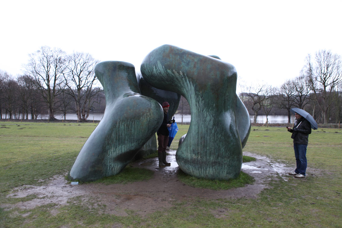
Yorkshire Sculpture Park was brilliant as ever, except that the more typical Yorkshire weather returned and rained on us throughout.
On our way back to the station we called into the Adjaye Market Hall, which, although visually impressive from a distance, seemed not to engage with its end users needs. Many stall operators we spoke of lamented the design, how much wasted space there was in the triple height inside market, and how business had suffered.


Following this we headed to Harry's Bar for a few local ales before heading back to London to ponder our findings. Suffice to say, Wakefield - well worth a visit!

Tuesday, 1 May 2012

Double Planning Breakthrough!


Edgley Design got two big breakthroughs recently. We recieved planning for Friern Rd, our large five bedroom family home in Dulwich, South London, after being refused planning and at committee. The scheme, which gravitates around a hundred year old listed pear tree, was granted permission in December 2011, two years since the site was purchased. The ground floor will be made of visual concrete. I'm sure Andrew will be blogging about this soon - it has afforded us the opportunity to work with David Bennett of Concrete Centre and David Bennett Associates fame (www.concretebennett.com/), and other concrete specialists. The first floor will be clad in a vertical timber boarding.

The second project we recieved planning for is Eashing House, our refurb and extention of a 1960's bungalow. Formally the concept was the wrap the existing forms in shiny stainless steel to reflect the beautiful countryside in Godalming. Spacially the whole replanning centred on connecting the internal spaces to the rolling gardens and woodland beyond, so large expanses of glass and open plan spaces unify the inside with the outside. To avoid solar gain the reflecting forms create large overhangs to shade the property in the height of summer.

 Watch this space for further developments - can't wait to see these two finished.

Monday, 30 April 2012

Young Architect of the Year 2011 longtlist

Edgley Design made the longlist of 30 practices for Young Architect of the Year 2011 in November. So sorry it's taken us 5 months to post this, but better late than never. The longlisted practices exhibited in an exhibition at the Architecture Foundation at Tooley St, London Bridge.

Click on the below link for an amazing digital survey walkthrough of the exhibition:
http://www.architecturefoundation.org.uk/programme/2011/autodesk-young-architect-of-the-year-award-2011

Congratulations to Jonathan Hendry who was given 1st prize - his work has a beautifully crafted, honed feel with a simple expression of texture and materials.

Next years YAYA 2012 will be ED's last chance to win before our principal Jake passes 40! Fingers crossed...


Friday, 18 November 2011

On Site at Amhurst Road

Yesterday we visited our project situated off a busy thoroughfare in Hackney - Rubber House/Aluminium Studio.

The main volume of the house is articulated as a black rubber clad box, tactile and seamless with a white wall that wraps around as a separate element, forming rooflights to the hall and stair.

The concept for the artists studio is for a simple aluminium clad shed. The shiny industrial material reflects the working nature of the studio, offset by minimal detailing to give a domestic quality.

It was looking good, some of the spaces were starting to reveal themselves, the kitchen dining room and its connection with the courtyard worked well. A particularly nice moment is in the snug where the rubber cladding moves from outside to inside (visually) through the glass (below image right).
The client is hoping to move in on the 6th December 2011, so not long until the inside is complete. We'll post the finished product on here soon. Watch this space for more of Rubber House/Aluminium Studio

Monday, 31 October 2011

Palestine Regeneration Design Workshop


Last Saturday I was invited to participate in a design workshop by the Palestine Regeneration Team (PaRT) and UN-Habitat, a UN led agency which promotes socially and environmentally sustainable towns and cities with the goal of providing adequate shelter for all.

PaRT is a initiative started by my former professor Murray Fraser, together with Nasser Golzari and Yara Sharif. Of the 20 people participating, there were architects from all over London, Arup engineers and native Palestinians.

The workshop was focused on designing an architectural intervention in the Gaza strip, just south of Gaza City. The site was an adjacent to a high school in the suburbs or Gaza City. The brief was to design a 'learning room', creating an interface between the surrounding villages and the school through the 'technical testing’ of self-help green ideas and prototypes for reconstruction by individual or groups of families. The Learning Room contains most of the principles emerging from the series of workshops that we have run over the last 2 years addressing reducing the use of resources in developing cities, including the use of appropriate forms of building technology, low energy water and drainage systems, greener everyday habits and self-help practices.

Obviously the situation in Palestine is horrific. The Israeli oppression is shockingly brutal, and their strangulation tactics on electricity, food and water supply are inhumane. All recognisable infrastructure has been destroyed and all import and export is banned. This leaves the Palestinian people in a fragile position. Some things do arrive through the illegal underground tunnels between Egypt and Gaza, although these come at a premium.

This uniquely deprived situation has a fascinating implications on their their habitats and building activity. With no new construction materials entering Gaza legally, and any imported through the tunnels affordable only to the wealthy few, people are forced to recycle everything and anything to create shelters for their growing families. Another interesting element to this project is the psychological image of certain building materials. Concrete is considered the sophisticated civilisation's material. The people of Gaza would love their regeneration to be built in concrete, though this is a relatively expensive building technique and of course requires imported cement. Rammed earth construction is a building technology which suits Gaza's current predicament and environment. It is thermally massive and requires relatively little imported building materials. However, this modern adaptation of an ancient building technique is viewed with shame in Palestine. They say, "why do you always want to put us in mud huts? We are a modern society, modern people. We should not be sent back to the dark ages where Israel wants us." It is difficult to argue otherwise.

The day was intriguing, and the ideas promising. We will now wait and see if the 'learning room' can materialise into a real part of Palestine and Gaza's regeneration. There's undoubtedly much more to design and people to persuade, but I'll try and keep updates on the blog.

Oriel Mostyn Gallery


In between getting hailed on and shivering on a recent holiday in Caernarfon, North Wales, I spent a morning at the Oriel Mostyn contemporary art gallery in Llandudno.

The project, by Architects EllisWilliams, is a refurbishment of a listed Victorian gallery building and has a central circulation core of board-faced concrete.


The variations in the concrete wall surfaces generated by the timber formwork created a wonderful play of light, accentuating the horizontality and persepctive of the space. The contrast between the warmth of the timber used for the stairs and the cool concrete also created a pleasing aesthetic which I hope we can explore in some of our current projects.


Exhibiting at the gallery was the work of David Nash which has a strong sculptural and material quality. Timber was the primary material and several of the pieces were made from burning the surface of the wood. This is a technique which I have been exploring in the office and the potential to use burnt timber as a cladding material. It was interesting to see the finish first hand and how the technique had been used in a different discipline.

To summarise, I had 'Oriel' good time

Tuesday, 25 October 2011

Bequia Buzz


We are pleased to see the recent flurry of posts heralding the delights of the 'Tower House' in Bequia. Our kind thanks to those championing our design around the globe, and to show our appreciation we fished out a few of our favorite features from that great internet ocean. . .

http://www.chictip.com/dream-homes/dream-home-tower-house-by-edgley-design

http://www.beachtomato.com/33684/wallpapers-awe-inspiring-beach-houses/

http://simbiosisgroup.net/2011/10/26/tower-house-by-edgley-design/

http://www.worldarchitecturenews.com/index.php?fuseaction=wanappln.projectview&upload_id=15565

http://www.materialicious.com/2011/10/tower-house-by-edgley-design.html

Tower House is also rumoured to be a finalist in this year's International Property Awards. More details to follow . . .


Thursday, 20 October 2011

Cracking concrete conference on the Southbank

Yesterday I spent the day at the Southbank Centre, London with fellow 'concrete-ophiles' for the 'Specifying Visual Concrete' Conference. The audience was a mix of Architects, Consultants and Suppliers and the guest speakers provided a great insight into different features and uses of concrete in construction. @thisisconcrete were 'tweeting' throughout the conference if you're interested in seeing what went on...

The Angel Building by AHMM

The big themes of the conference seemed to be about how the construction industry can change clients' perception towards concrete and how it can be used sustainably. Thermal mass was the buzz word for the day and it was shown how it could be used to negate the need for air conditioning and thus offset the carbon created during its construction.

Hepworth Gallery in Wakefield by David Chipperfield

All the guest speakers were engaging though my particular highlights were the talks by Steve Smith from AHMM on the Angel Building, Alex Waight from Allies and Morrison on their office building, Anton Sawicki from Ramboll on the new Hepworth Gallery and PhD candidate John Orr on fabric formed concrete which introduced some exciting possibilities for the way concrete could be used in the future to achieve structural efficiency and complex geometry.

To summarise, this conference really cemented my love for concrete.

'One must be entirely sensitive to the structure of the material that one is handling. One must yield to it in tiny details of execution, perhaps the handling of the surface or grain, and one must master it as a whole.'
Barbara Hepworth

Tuesday, 20 September 2011

End House woos the crowds at OPEN HOUSE 2011


End House, Edgley Design's project completed in 2010, was one of the houses open to the public at this years Open House 2011.

The house in Croften Park, South East London, saw over 400 curious Londoners walk through its doors on Saturday 17th September.

Hosted by Jake, myself, and the owner Michael and his Mother, we entertained the usual array of interesting personalities; intrigued neighbours, fellow architects, diy enthusiasts and 'Grand-Design-ers' all came in their droves to inspect and glean tips on the art of modern domestic house building.

It was great to see how the owner Michael had personalised the spaces with his own furniture and style, and we were also delighted to hear how much he enjoyed living there.


A lovely lunch and only one awkward customer later, Jake and I headed off to see some fellow Open House properties, which included 2 Ashmead Mews, and the Duggan Morris house Kings Grove, the private residence of principals Joe Morris and Mary Duggan. The building has a composition of rich materials; the pink hue of the internal brick and the oak cabinet panelling complimenting the brass details. Jake's highlight was the exotic brass strip on the impressive glazing units. If it's open next year, go and see it, if only to have a nosey at their offices beautifully crafted models!

Thanks to all who came!

Tuesday, 13 September 2011

"11 Flirts"_Tallinn Architecture Biennale (TAB)


The exhibition "11 Flirts", which is part of the TAB, is open from 9th-25th September in Tallinn, Estonia. http://www.tab.ee/#exhibition

I am exhibiting a perspex and steel hanging installation amongst an incredible collection of masterpieces within Kadriorg Palace, the 18th century Baroque summer residence built for Peter the Great in 1718. http://en.wikipedia.org/wiki/Kadriorg_Palace

A couple of months ago Villem Tomiste approached me to exhibit in the curated exhibition "11 Flirts", through an article of my work on dezeen http://www.dezeen.com/2011/06/28/london-without-bees-by-ben-kirk/.

I visited the city this weekend for the opening of the exhibition, and other TAB parties, which were great. One of Europe's most enchanting cities (according to the Lonely Planet), the meandering cobbled streets and beautifully restored mediaeval Old Town are the perfect place for a city break. And if you fancy some modern design with your steaks, turrets, cannon balls and cassocks, then Tallinn and specifically Kadriorg Palace is the place for you!!

Friday, 9 September 2011

End House Opens its Doors


Open House London is happening again on the 17 - 18th September, and as part of the city's annual architectural showcase, End House is open to visitors on the Saturday from 9-2.30pm.
The event provides the opportunity to go and scout around architectural gems that are usually closed to the prying eye. We are looking forward to visiting a favorite project of ours by Duggan Morris Architects in Kings Grove - a great example of clean beautiful detailing.

Check out other spaces flinging open their doors . . . www.londonopenhouse.org/index.html


Friday, 25 February 2011

RIBA emerging architecture: NHDRO


Inspiring lecture from NHDRO as part of the RIBA emerging architects series this week

It was the last in the emerging architects series this year- dominated by Asian practices, it is perhaps symbolic of the relative vibrancy of the eastern economies at the moment.


http://www.nhdro.com/
My youthful experience of working in Hong Kong gave me an impression of Eastern bling culture- zippy, exciting buildings with shiny millimetre thick facades built quickly and cheaply, without pausing for reflection on culture or context.
NHDRO are inspiring in that they are bringing a creative and thoughtful approach to counter the opulent tastes of contemporary Chinese culture. Big, bold forms, strong ideas and an articulation based on materiality rather than detail- modernism meets sculpture. It’s encouraging that while they are pushing against the mainstream, they are clearly very successful.
There are many young contemporary architects exploring this kind of formal modernism, ourselves included, but what’s exciting is the ideas of how to take this approach to a larger scale, in contrast to the now accepted pared down hi tech rationality of much London commercial building.

Also interesting- the reuse of a derelict colonial building in Shanghai:
http://www.architecture.com/WhatsOn/Exhibitions/At66PortlandPlace/2011/Spring/EmergingArchitectureonlineinterviews/InterviewNHDRO.aspx
The building is preserved untouched, like an urban ruin, the textures and decay of the building offset with clean and bold additions to reconfigure the building. In a part of the world where little thought is given to legacy they point to a chance to preserve some essence of past culture. It’s also a great example of reusing an historical building in a sensitive but entirely modern way

Sunday, 9 November 2008

Cruickshank Street- Design and concept


Cruickshank
Street is a new build house on the site of a derelict garage in the Amwell Street area of Islington, London, due to complete on site in December 2008.

We inherited the project from architect developers, Envelope, who had succeeded in gaining a change of use for the site, and permission for a three bed house with a split level arrangement, dropping half a level from the front of the house to the rear.

We redesigned the house internally, taking out the split level to create a three storey house over basement, ground and first, to create a more open plan and accessible house, with the living space and garden on the entrance level.

The principal challenge of the house was that the site while excellently located, was extremely long and thin. Difficult sites however often force interesting design solutions: it's not possible to create good spatial experience with conventional design, and the design of the house often arises directly from the constraints of the site rather than through the imposition of willful forms or layouts- these projects have to work hard to succeed, and it is this challenge which hones a strong design.

Only a very limited amount of glass is allowed along boundary lines for privacy and fire reasons. This meant that light needed to be brought in through the roof of the house as well as the front and back. The stair forms a three storey high lightwell, with opening glazed roofs that flood the centre of the building with natural light. They also open for ventilation, which draws stale air up through the building as hot air rises, naturally ventilating the building- this is known as stack effect ventilation. I feel strongly that air conditioning in our climate, particularly of residential buildings, is grossly wasteful, and the building is designed so that all rooms have at least one high level vent panel for fresh air, which combined with the stair to expel stale air will cool and ventilate the building naturally.

A second smaller lightwell drops from the rear yard into the basement to bring light and air to the master bedroom. This lightwell is open both to the bedroom and the ensuite bathroom, creating a private, atmospheric and spatially luxurious bedroom stretching half the length of the basement.

Aesthetically speaking, the design evokes the concept that in our changing environment we need to rediscover the delights of natural materials that weather and age, and of solid buildings with carefully framed views and controlled natural light, in opposition to the slick, glassy and flimsy aesthetic that symbolises the high tech age of recent architecture. I also believe that 'eco bling'- the tendency to use high tech gagets to claim an eco design that is the successor to high tech- rarely pays environmentally. We need houses that are located sustainably, organised to allow sustainable living, built using sustainable materials, and designed to last- a high tech eco building which lasts only 30 years leaves a huge environmental footprint. Often a simpler, low tech construction and ethos is more environmental, as well as creating buildings designed to be a sensory pleasure.

Working around a minimal pallet of walnut and birch ply, almost every item of joinery in the building has been designed and built from scratch, from the solid walnut windows with integrated doors and vents, to the sculpturally composed shelving and cupboards in every room in the house. The stair has been designed as a sliver of walnut rising from basement to first floor with delicate glass handrails, with a perspex chandelier designed by the architect dropping 12m through the centre.

From a technical point of view, the two boundaries were only 4 metres apart, and this meant the house needed to make maximum use of the width of the site. This led to the adoption of a specialist piling system developed in Germany by
Ishubeck Titan, which uses thin sacrificial screw piles. These 75mm piles can be accurately placed at 600mm centres, and retain the soil while the basement is excavated. Once this is complete reinforcment is welded directly to these piles, allowing structural walls to be constructed very close to the boundary- around 250mm overall against perhaps 750 for a standard concrete pile, with a huge reduction in concrete (which while often unavoidable to a degree underground, has poor environmental credentials)

For the superstructure, we used SIPS (structural insulated panels) made
offsite in Devon. These are insulation sandwiched between two sheets of timber board, which is then factory machined to a high tolerance before being brought to site. The resulting panels are very quick to install (around two weeks, which helps with neighbour relations on tricky sites), good value, and all with excellent environmental performance- the building is effectively built out of solid insulation.

All in all this building shows that careful design combined with modern timber based construction techniques can create exciting and functional space on the most unpromising sites, all within the budgets of
mainstream developers. While the building was spec built, we believe it would do justice to the most discerning and adventurous self builder.

Sunday, 6 January 2008

Edgley Design Mission Statement


Our aim is to design simple, beautiful contemporary spaces and buildings that are a pleasure to occupy and which are adaptable to the needs and personalities of the people that use them, and that have a minimum impact on their environment, both in the short term of their construction, and in the long term of their aesthetic and physical impact on their surroundings and in their long term sustainability.

There is much talk about conservation of energy, which is of course a vital issue in the design of buildings, but I also feel that the material impact of buildings on their environment is an important issue. In the last 50 years we have designed buildings that are designed to resist nature, with glass and metal skins that need to be frequently cleaned to preserve their newness, and their aesthetic perfection. We have drifted from the timeless understanding of weathering, and the design of buildings which develop a patina and aesthetic through exposure to nature. This comes down to a simple concept of buildings which are part of nature, rather than an opponent to nature. In the high tech boom of the latter 20th Century we all believed that science and technology could beat nature- we have now discovered that this is all too true and we need to respect nature and work within our environment, rather than repress it.

I also believe that this can be a positive influence on architecture and design. We used to live in a world where we made economic use of natures resources in a far more sustainable way than we do today- the power of rivers ground our corn, wind powered our oceanic transport and timber grown above ground heated our houses (releasing carbon captured during the life of the tree, rather than carbon locked underground in fossil fuels). A return to these principles can reduce the cost of living, and reduce our dependence on energy supplies on a national scale, increasing personal independence.

On a material level, buildings which age beautifully need less maintenance, and are more likely to be reused and adapted, which is all too apparent with the Londoner’s love of Georgian and Victorian housing and comparative lack of emotional attachment to the decaying panellised buildings of the mid 20th century. These old terraced houses are often very basic, but their simple construction allows great flexibility and adaptation, allowing spaces to be altered or even added to modernise the buildings. The average ex council house, however, is often built in a way which makes any kind of structural alteration a dangerous impractibility, coupled with stingy space standards which reduce the basic appeal of the spaces and bad detailing with weathering details removed in an attempt to create a simplified minimal aesthetic.

If we can find modern techniques for building housing that are more responsive to these issues, then we will create buildings which last longer, and this in itself will make these buildings hugely more environmentally sustainable, as an enormous amount of energy is embodied in the construction of a building, and every time we rebuild we consume enormous resources of energy and material. This does not mean re-creating traditional buildings- modern, light filled interiors and clean exteriors have much more to offer than cramped and dark Victorian houses- it is simply a recognition that we need to adjust modern design to create buildings which have the longevity of London’s 19th and 18th century terraces.

Many of these concepts are tied to an idea of building using natural materials and simple construction techniques. Natural materials such as timber, brick and stone are more likely to weather and age, and are also more climatically responsive allowing buildings to breath naturally, avoiding the need for mechanical ventilation and air conditioning when used correctly. Indeed, these concepts are equally applicable to all building types- why, in London’s temperate (and let’s face it, often pretty chilly) climate do we construct buildings that need to be air conditioned every day of the year? It should be possible to reduce our dependence on mechanical climate control to a minimum, needed only to deal with extremes of climate. As with all these issues, there are fringe benefits in that a naturally ventilated space is far more pleasant to live in.

Another benefit to these themes is that by designing buildings that are conceived in a simple way, making the most of the space that they occupy and the materials that go into their construction, we make the most economic use of resources, and I believe exciting modern buildings can be created on modest budgets if they are carefully designed.

This leads me to a simple description of the buildings that we intend to design- simple but intelligent buildings which are a part of the natural world which they inhabit, both technically and aesthetically, which are designed to mellow with age, becoming with age objects with more patina and character than can be built new.

There is much to explore and experiment with, and many of these issues will never be resolved, rather requiring constant cycles of improvement. This, however, is the exciting challenge which faces our generation of architects and designers.

Designing Chapel Market

I acted as both developer and architect on this scheme for two new houses, so there was no client involved.

I was able to buy the site due to its many constraints and problems- there was no street access, with a right of way entrance over the adjoining neighbour’s land. The site, located behind a row of terraced houses, was surrounded by a 4m high party wall which limited the light and views available to the site, and added the need for 7 party wall agreements with neighbours. The existing workshops had been abandoned for several years and were in a derelict state, inhabited only by several hundred pigeons.

As my first new build as an independent architect, the brief was simply to create architecture of the best possible quality on an unpromising site, within the financial constraints of a successful development. It was also an opportunity to explore themes and technology to form the ethos of a new practice.

The challenge was to create a sense of light, space and privacy in a site which is surrounded by a high wall, with many overlooking windows to the north (entrance) side. The strategy was to turn the houses in on themselves, turning them away from the houses to the north and opening up to the views and light from the south. All that is visible to the visitor is a narrow timber wall and two doors at the end of a long alleyway. The height and form of the building is almost entirely defined by planning restrictions and neighbouring rights to light issues.

We pulled back the building line from the south wall, to create a series of courtyards and terraces, and to create an external elevation that allowed us to bring light and air into the enclosed lower levels of the house. This also creates a private, sequential experience as you enter the houses, with the spaces gradually unfolding first into an open living area, and then out into an internal courtyard, an intimate and private space deep within the plan of the house.

The route to the upper floor is via a tall, narrow top lit stair to rooms with views south across the backyard roofscape of the area. Full height glazed doors lead from the bedroom to a terrace overlooking the courtyard below, giving a three dimensionality to the exterior spaces.

A lightweight steel frame was chosen for speed, driven by the need to carry all the building materials on to site by hand, through a doorway and then down a 12m accessway. This was then framed in timber, with masonry cladding to the noisy north elevations, and sustainable sweet chestnut to the south to create a natural feel to the internal courtyards.

The houses are finished in luxurious natural materials- limestone and walnut- that are inviting to the touch and the barefoot resident. As you step out into the courtyard, the bare brick walls reflect the history and age of the site, a perception heightened by contrast with the modern surfaces of the new houses.

Internally, a minimal palette of luxurious natural materials- mainly walnut and limestone- were used. This palette was consciously kept to a minimum to create a sense of harmony to the spaces, while creating a series of individual elements thought the houses to create identity in the various spaces, such as giant opening walnut doors to the courtyard, that form a snug in winter behind, but open up in summer to the courtyards.

Large areas of fixed glazing to the ground floor draw the space of the courtyards through to the interior during the winter, while solid elements articulate the entrances. To the first floor, smaller windows define views out across the surrounding rooftops, reducing solar gain.

The budget constraints were very tight, to the extent that the project was delayed for a year post planning while we searched for a design and contractor that could produce a building within the budget.

We were very lucky with our choice of contractor, and once the project started on site in Jan 2006, we progressed very quickly to taking part in Open House in Sept 2006.

Many elements were designed during the construction phase in collaboration with the main contractor, who made all the windows, doors and internal joinery from scratch, mostly from solid walnut.

The basic financial strategy became to rationalise the design of the buildings as much as possible, removing any wasteful overhangs, cantilevers or other complexities from the basic shell, and minimising the number of elements required to produce the finished envelope. This approach allowed us to then retain the natural finishes and high quality components that define the experience of living in the houses.

I feel that the final result is a piece of architecture, created for not much more than the cost of building a standard London developer spec house. The cost in the process, however, has been the enormous investment of design time that this project needed- being the developer was very beneficial in allowing us to make this investment of time profitably.

As the ultimate test of a design, I am now living in one of the houses, and I expect the details of the house to evolve over time as the rational shell of the original concept is gradually personalised.

Constructing Chapel Market

Chapel Market was always going to be a tricky build. Access to the site is very limited- through an alleyway off Chapel Market itself- and it had taken quite a while to find a builder willing to take the project on! Every piece of material had to be manhandled 20m from the street into the site, and bar a lightweight digger there was no plant on site- spades and wheelbarrows for the excavation!

This access directed the basic construction strategy more than any other issue. Buildings of this type can be built using a range of off-site construction systems, such as SIPS timber panel systems or prefab modules, but these all require crane access, which was not a practical option, so in collaboration with the engineer the building was designed around a lightweight steel frame, made out of a large number of small pieces that could be carried into the site by hand. This system had the added benefit of being very light, which was less likely to unsettle the many surrounding old buildings.

The first step was to clear the existing buildings on site- three derelict workshops that had been home to a troupe of pigeons for several years.

We then underpinned the surrounding buildings- the site is bordered by a 4m high wall on all sides, and this Victorian wall had practically no foundations on three sides. The overall height of the building was very restricted by planning issues, so we needed to lower the ground floor by 450mm. Even this modest change in level involved exposing the brick corbels to the surrounding wall, so a full underpin was needed to three quarters of the boundary- quite an awesome task, particularly as all digging was by hand to avoid disturbing surrounding buildings.

Next a raft foundation was poured over the site. This foundation has no footings- it spreads the loads evenly over the entire site, and allows columns to be fitted wherever they are required.

The lightweight steel frame was then installed- this was the largest subcontract on the project which made for some complex co-ordination between designers and contractors. There was quite a long delay to the delivery, as the supplier was supposed to make a detailed survey of the site and fine- tune the steel design accordingly. When I got the first steel drawings for review I was more than slightly suspicious to see that the setting out was identical to our drawings, made from a pre-demolition survey of the site! The question was whether to force responsibility to the contractor and risk a problem, or take the huge risk of surveying ourselves- I took a deep breath and measured up the site with a disto laser- quite accurate, but not really up to this task, particularly as non of the site walls were straight.

We drew and re-drew the setting out, trying to allow for all the curves and distortions of the side walls, then ordered the steel. When it turned up on site it miraculously fitted, although it was very lucky we had designed two separate frames- these had to be angled slightly to one another to make the frames fit the site.

All things considered the steel frame came together quite easily. There was some colourful commentary on the design when it came to bringing the beams to the main ground floor span on site- these were not light weight at all, to the extent that the tyres on a little trolley the installers used exploded. Somehow the steel was manhandled into position and winched up into place, and once the cross bracing went in we had a stable structure.

From this point on the building technologies were more traditional, and more along the lines that the main contractor was used to. The entire site was lined with a basement tanking system, as many of the surrounding walls were exposed to the elements with dubious waterproofing credentials, and then the steel frame was lined with timber stud.

It’s an interesting paradox that so much timber was required to make this steel structure into a building, to the extent that I would describe the end product as a timber framed house stiffened with a steel frame. We had intended to use industrial metal stud, but the contractor felt that this would give a ‘hollow’ feel to the finished building and recommended a stiffer timber stud. Watching the spaces of the building slowly emerge as skilled Polish joiners formed every surface from timber was the most exciting phase of the project. When the first floor joists were complete, I found out to my surprise that there was a fantastic view of surrounding urban gardens from the bedrooms!

The parts of the building facing the noise and smells of Chapel Market’s restaurants and shops to the North are faced in concrete blockwork, but to the South the timber frame is exposed. Breathable membranes were wrapped around this frame, clad in coppice-cut sweet chestnut from Kent, a sustainable material cut from young trees that needs no sealant or maintenance.

The roof was finished with a cold applied liquid membrane. This is applied like a paint over a fibre mesh, giving a homogenous surface without any of the weak joints of a standard bitumen system, or the dangers of a hot melt asphalt on a timber building.

All of the exterior joinery was hand made by the contractor himself from solid Walnut. I was very lucky to have a contractor with the skills to produce this kind of work- it cut down all the co-ordination that would have been needed if the joinery was sub-contracted, and allowed the details to be designed and negotiated as the build progressed (not an advisable design strategy given the contractual risks, but it gave us a great opportunity to develop the design as the build evolved)

The contractor went on to hand build all the internal joinery, including internal doors, the kitchen from scratch, bathroom vanity units and wardrobes, to the extent that every piece of fitted furniture was created bespoke for the building.

When the buildings were finished Katherine and I decided that the opportunity to live in a home that I had designed was too great to miss, and we moved in to one of the houses. The design of the houses as first complete was purposely plain internally, to allow the inhabitants to personalise the their space. Once we had moved in, however, we decided to build in some extra joinery to make it our home.

A long two person desk now completes a study in the spare bedroom (with an extra wardrobe for long dresses- the architect rapped on the knuckles for previously overlooking the need!). The small ancillary room to the main living space has been made into a snug, with a fitted sofa, and a collage of shelving, orange lights and recesses for sculpture and objects.

Finally, a new door to the alleyway and a post rack has concluded my first new self build, and at four years since the search for a site began, it’s a welcome relief to finish! Now I’ve finally got time to look for another site….